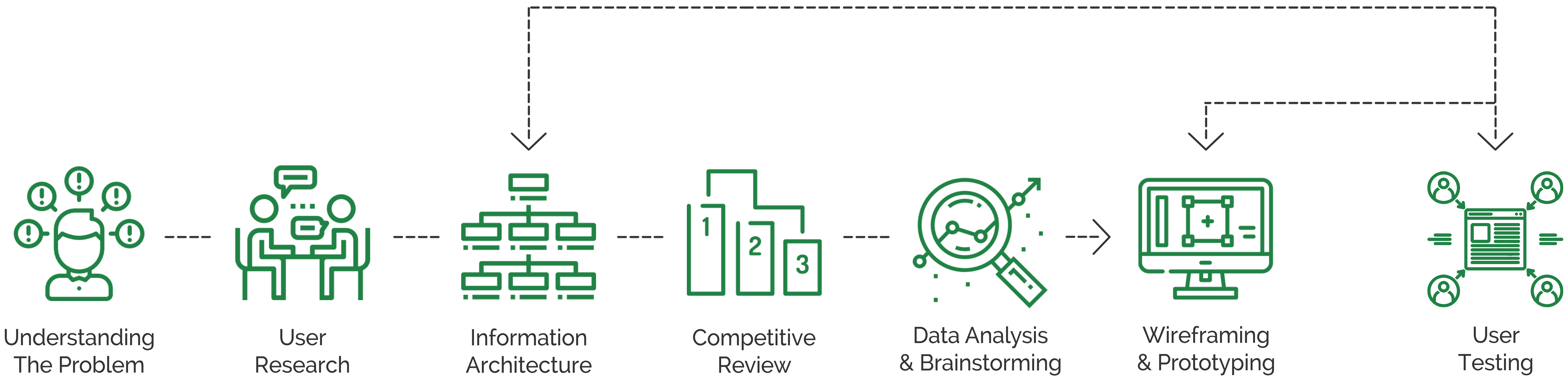
Our Approach To Solve This Problem
Overview: This project involved redesigning the Information architecture and the improving user's experience of the Sesame Worksop's website.
Sesame Workshop is an American non-profit organization which has been responsible for the production of several educational children's programs that have been televised internationally.
My Role: I was part of a small team alongside Sanchit Kumar. I was responsible for conducting user research, restructuring the information architecture, conducting competitive reviews, and designing low and high fidelity prototypes.
Discipline: UI/UX Design, Information Architecture, User Research, Interaction Design, Prototyping
Design Tools: Sketch, Photoshop, Marvel, Balsamiq
Research Methods: Surveys, Interviews, User Testing
Duration: Fall 2017, 15 weeks
Sesame Workshops website contains very informative content that can benefit its users. However, a high number of it lacks visibility and needs some improvement in its Information Architecture and Visual Design.
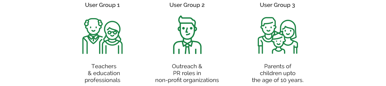
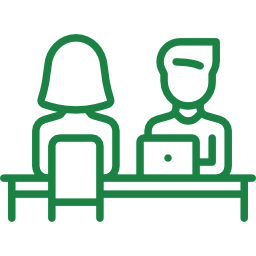
With the motive of gaining a deeper understanding of the website’s users, we started the redesign process with user research. We divided our target audience into three different groups and used interviews and questionnaires as our research method.
To learn more about the user groups, we started with interviews which were semi-structured and conducted in-person. From the interviews, we wanted to gauge the user’s interests, what drives them to a non-profit organization’s website and what they look for it when they get there. In addition to the interviews, we also gathered some insightful data through an online survey.
In all, we conducted 20 interviews with the user groups out of which 14 were in person and rest were either email or telephonic. Questions in the interview aimed at knowing their last experience with any non-profit organization's website, their expectations from an ideal website and what do they usually look at a non-profit organization's website?
The response rate of the questionnaire was high as we received approximately 30 responses from our research. The research mainly focused on gathering data about the user's habits and experience when they visit a non-profit organization's website.
After conducting user research through the selected methods and analyzing the data, following insights were learned -
A majority of the users said that the information on the website should be precise and concise. They also mentioned that the website should have clear and attractive navigation labels for better and easy use.
"I like to see more of infographics and images on a website. I think photos speak more efficiently than words and most of the times I don’t have time to read all the content." - Participant of User Research
Almost every respondent of the questionnaire stated that they do not like advertisements and pop-ups while browsing a non-profit organizations website.
"Advertisements and pop-ups hinder the user's ability to read and a non-profit organization should not focus on generating revenue from advertisements. Instead of this, it should focus more on providing relevant information in order to educate their target audience." - Participant of User Research
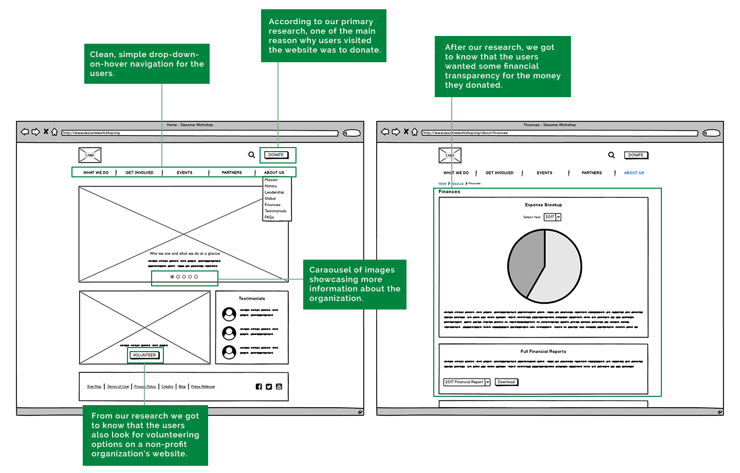
Through the interview process, we realized, 70% of the interviewees wanted to see a graphical representation of how their donation was being used. Furthermore, a similar response was seen in the online survey.
"Financial transparency is one thing which is expected in all the organization worldwide especially where people are donating money." - Participant of User Research
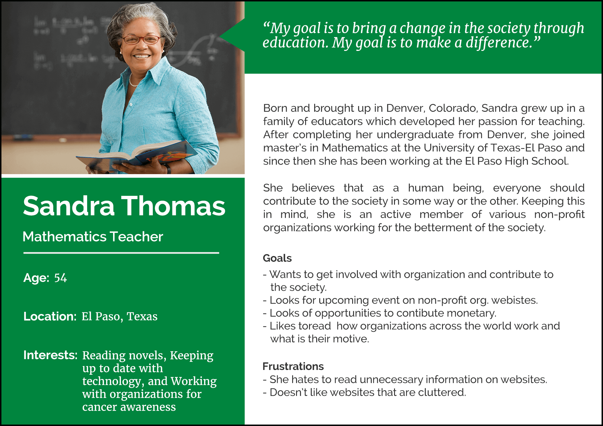
After analyzing the data, we created user persona of one of the primary user of Sesame Workshop - teachers and education professionals. It mainly had information about their behaviors, interests, pain points and their needs.
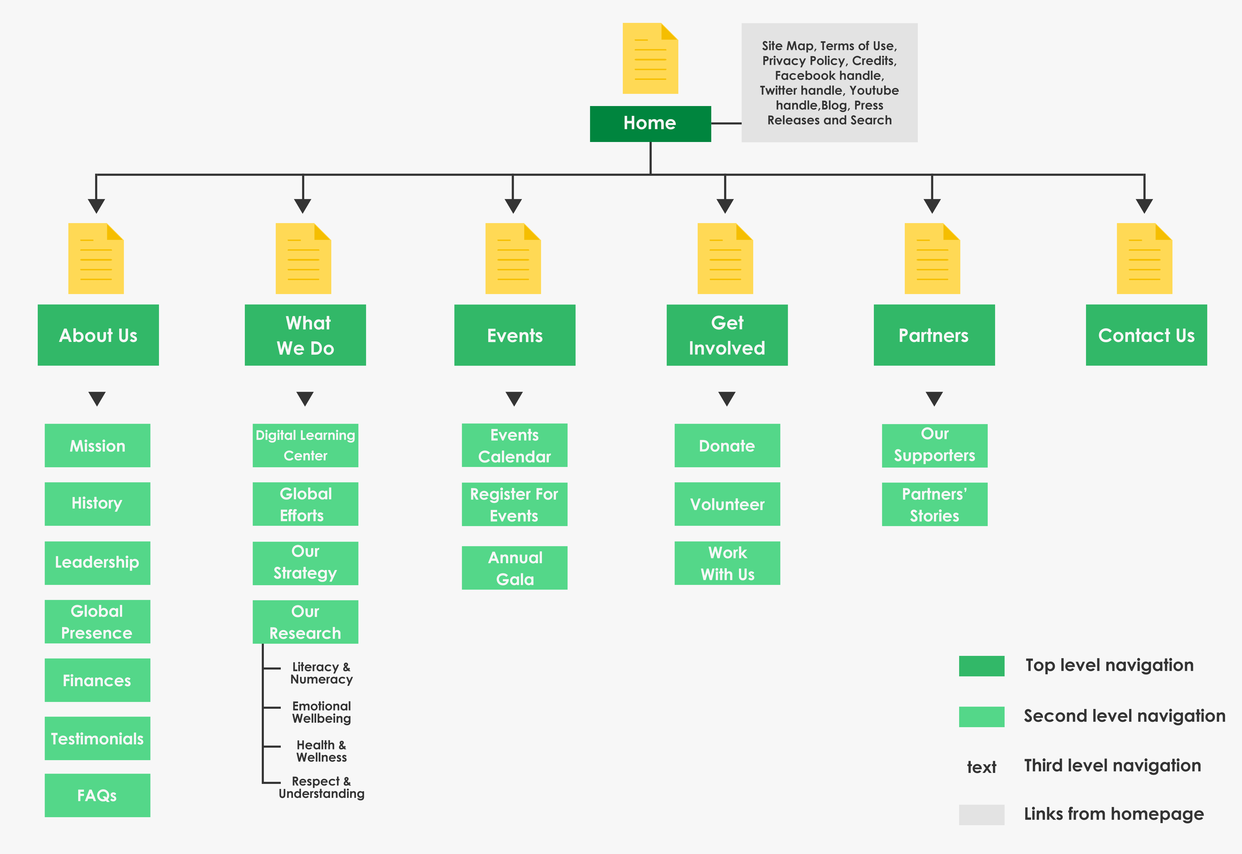
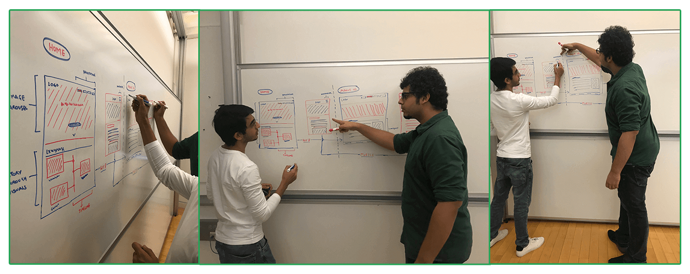
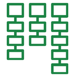
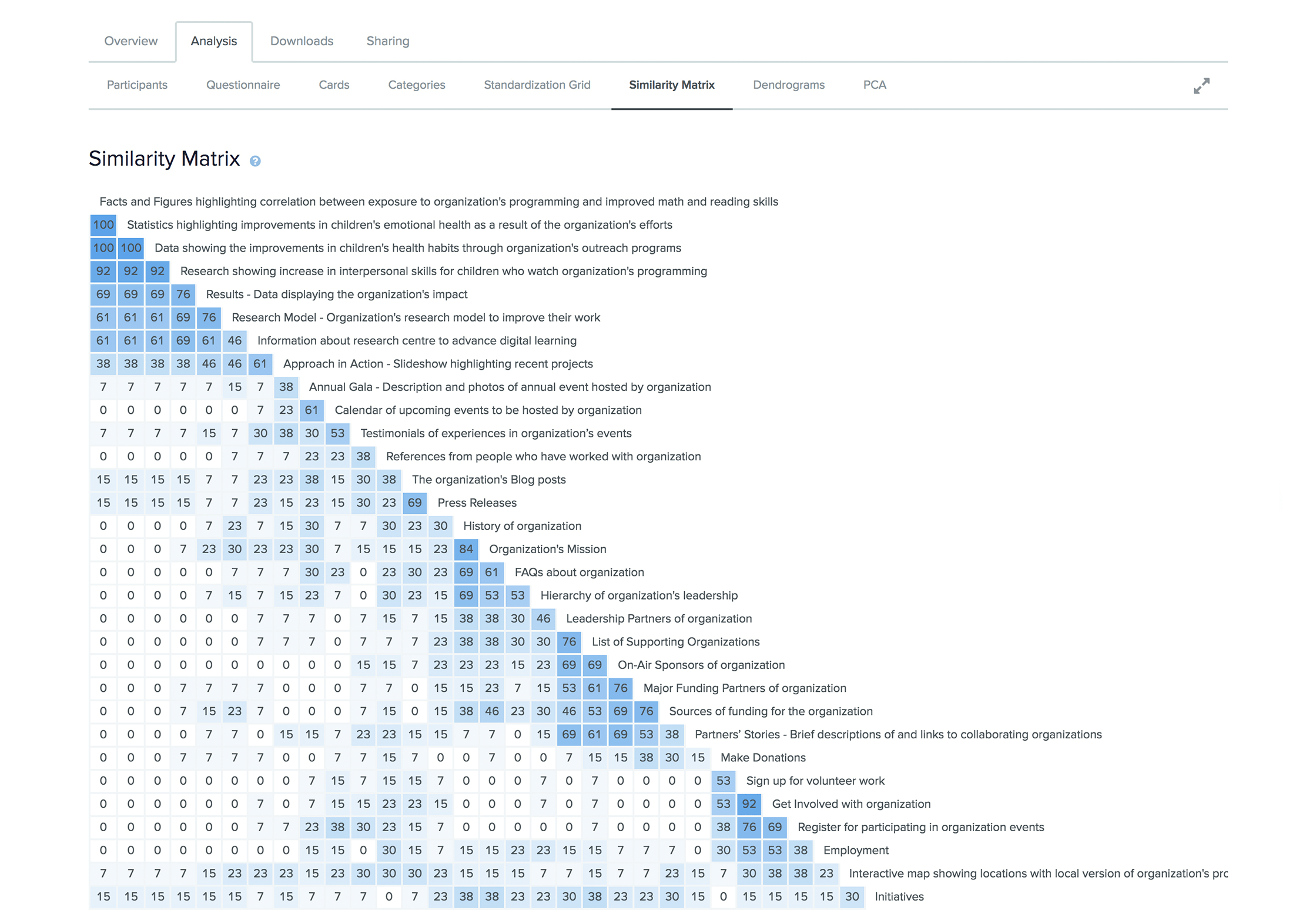
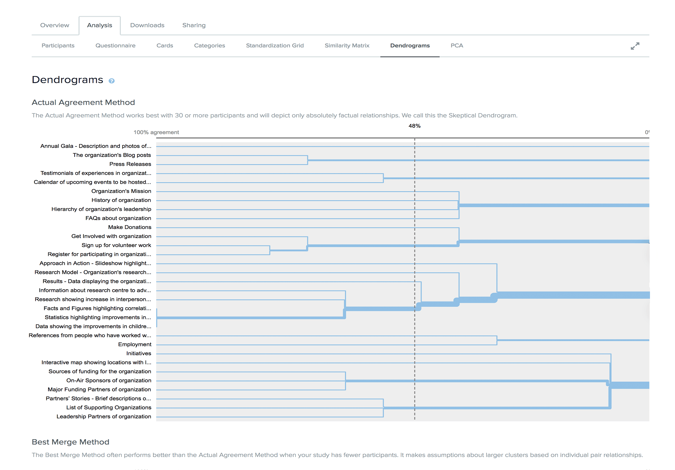
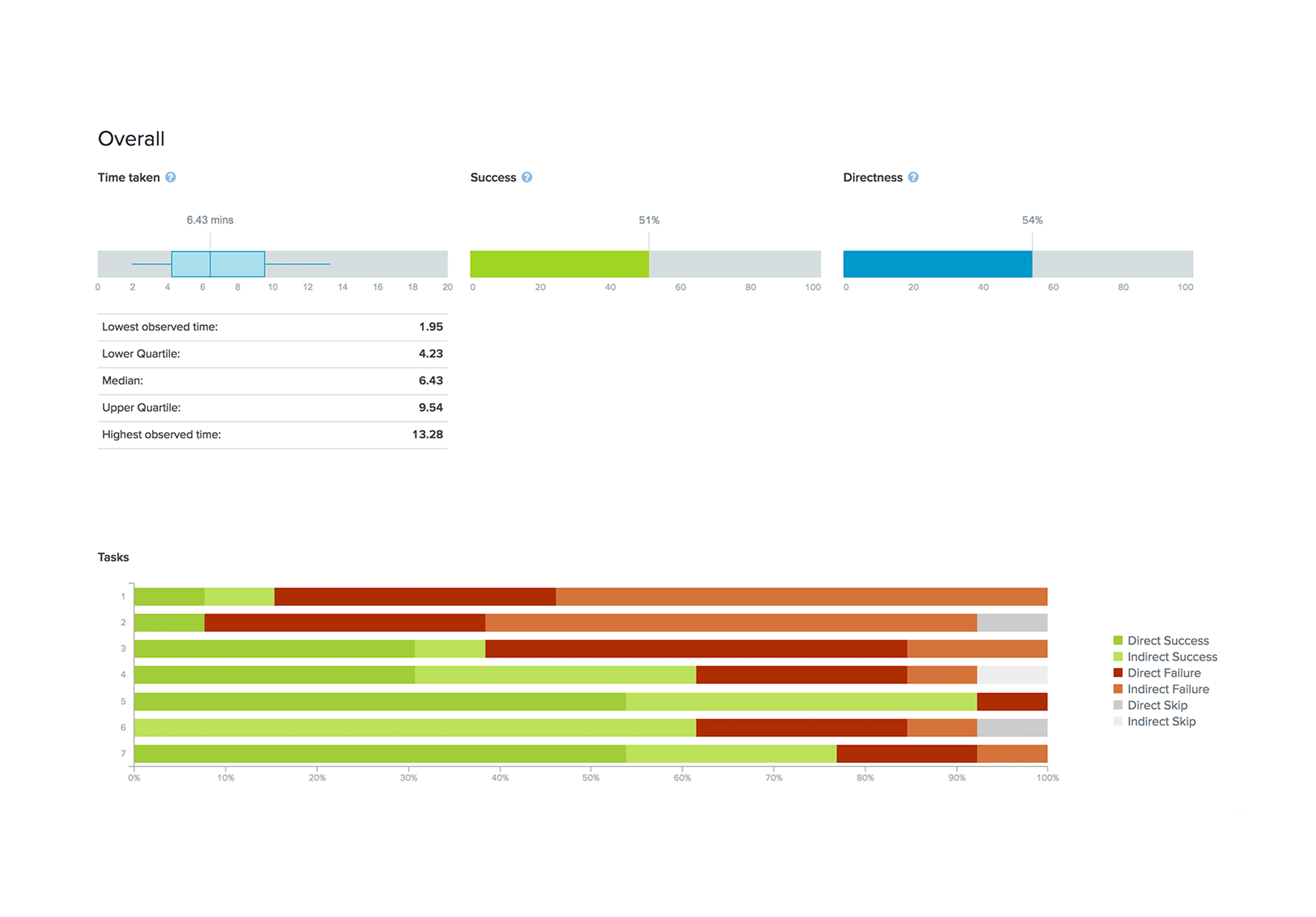
The next step of the redesigning process was to gather insights into our users mental model. It helped us create usable content structures out of complex sets of information. We started this process with card sorting in which the majority of the participants took part remotely. Then we moved to the analysis phase where we careful analyzed of the card sorting results. It helped us in refining our content and structuring it further into a tree test which was used to conduct more research. Both the activities gave us valuable insights related to the navigation and information architecture which culminated to a sitemap for the website.
We recruited 12 people to individual sort 31 cards with most descriptive labels possible. While we found that 84.6% of users rated the labels “Moderately Clear” or “Very Clear,” some labels frequently proved confusing. Consequently, we pulled those most commonly cited to evaluate in our tree test. Additionally, we learned which labels our users expected to find together from the Similarity Matrix, Dendrograms, and PCA. Our result was a rough draft of our site’s top tier with 6 labels, in line with the average six groups created during the card sort.
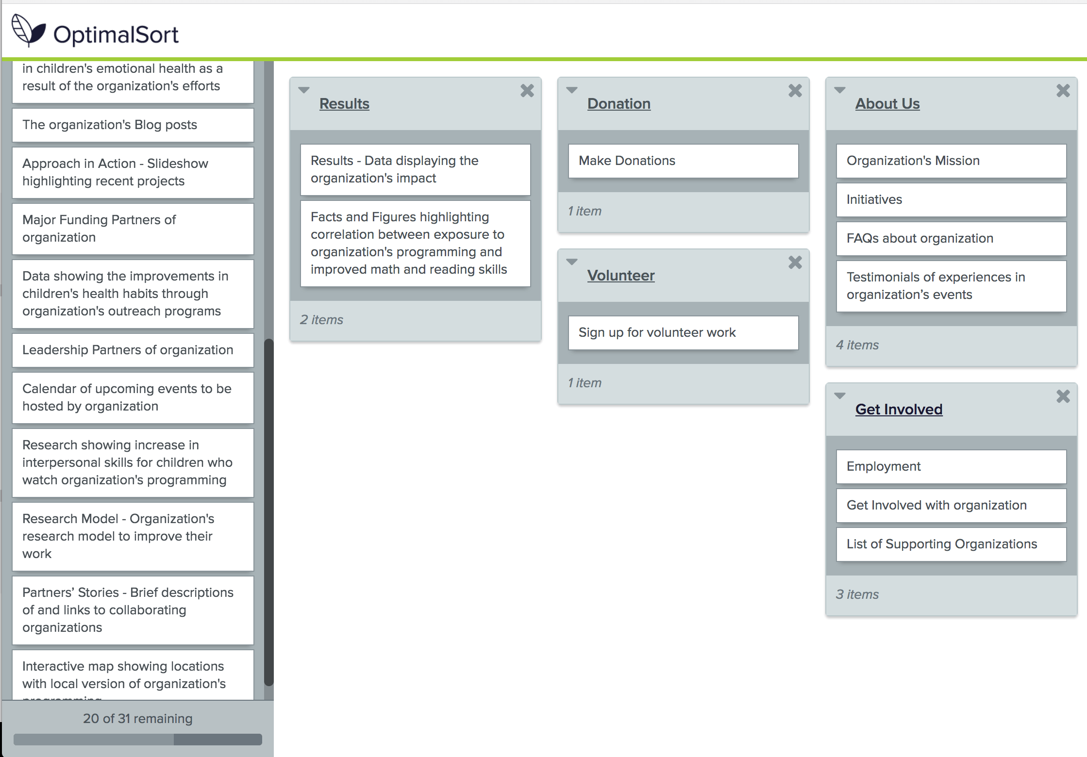
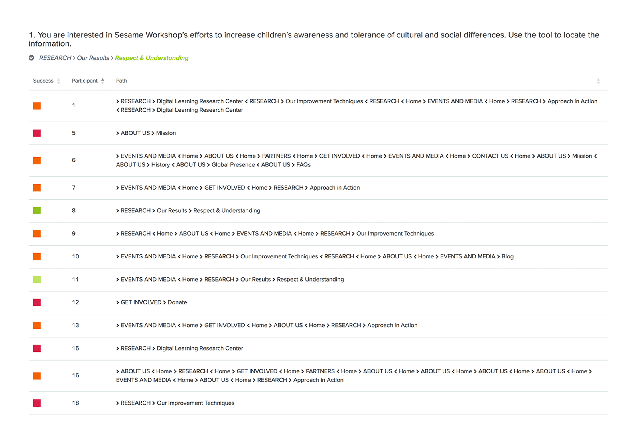
In transitioning from card sort to the tree test, we shortened our labels to prioritize the mobile screens. We created 7 tasks and recruited 15 participants for the same. Our tree sort participants gave feedback after every task, and their comments, alongside the “Pie Trees” of their various pathways through the hierarchy, revealed shortcomings in the structure. Using this data, we reorganized the sitemap to follow the logic employed by the majority of our respondents.
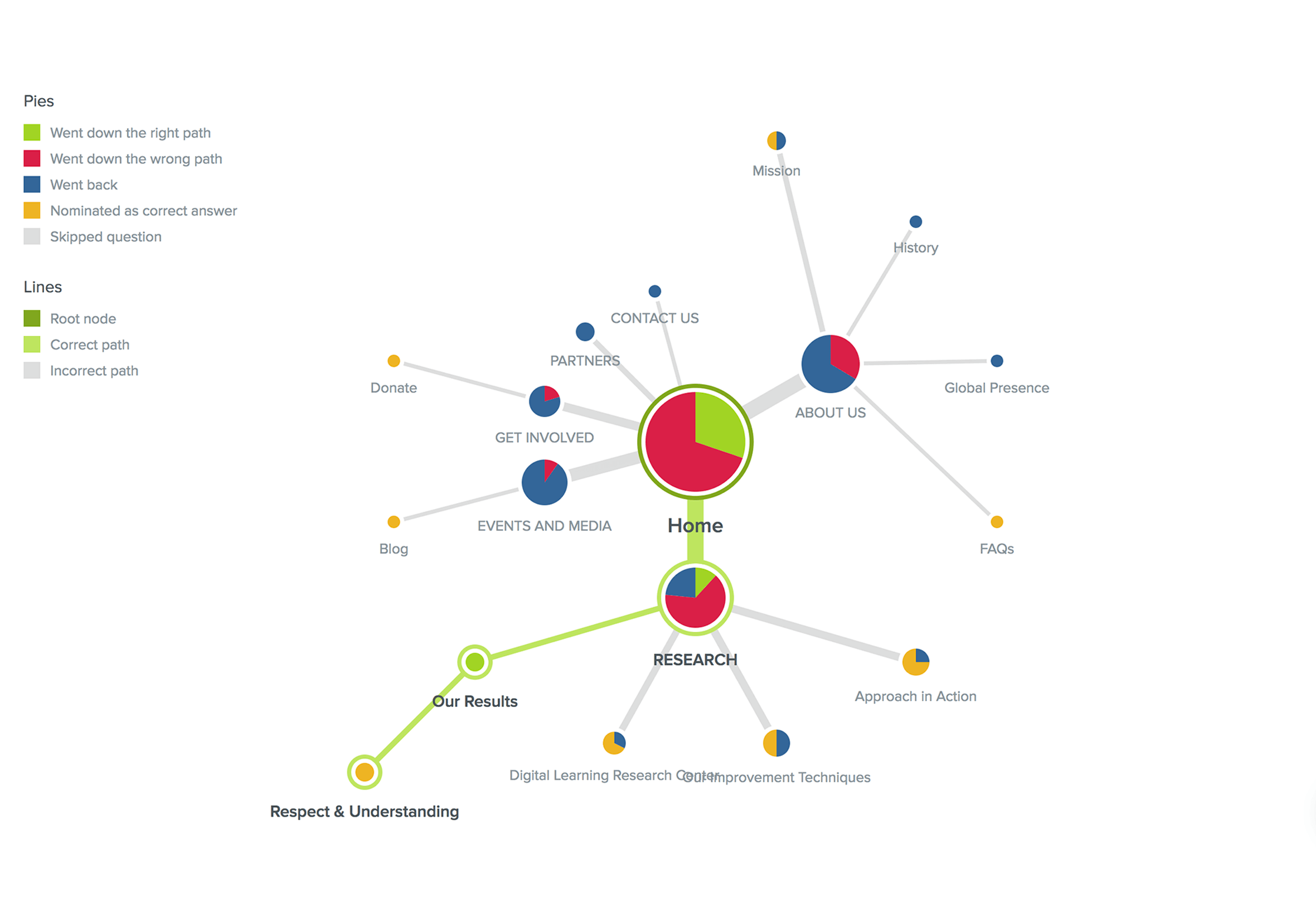
In some cases, the labeling and/or structure of the original site remained constant throughout user testing. For example, the “About Us” top-tier label, as well as “What We Do,” are present in our final sitemap because attempts at revision worsened clarity or inhibited successful navigation.
When working through our tree test tasks, confused users mentioned that they made their way by finding synonyms in the task and the site hierarchy. This approach was not always successful but provided insight into how users categorize content and how they operate when searching for new information.
Striking the balance between clear and succinct is an ongoing challenge. During our card sort observations, two-thirds of users mentioned that the longer captions were more difficult to categorize. After the tree test, our solutions included both strict editing and consolidation of related content into fewer pages.
Based on the card sorting and tree testing results, an updated sitemap with a three-level navigation was developed. This process helped us in developing a user-friendly interface.
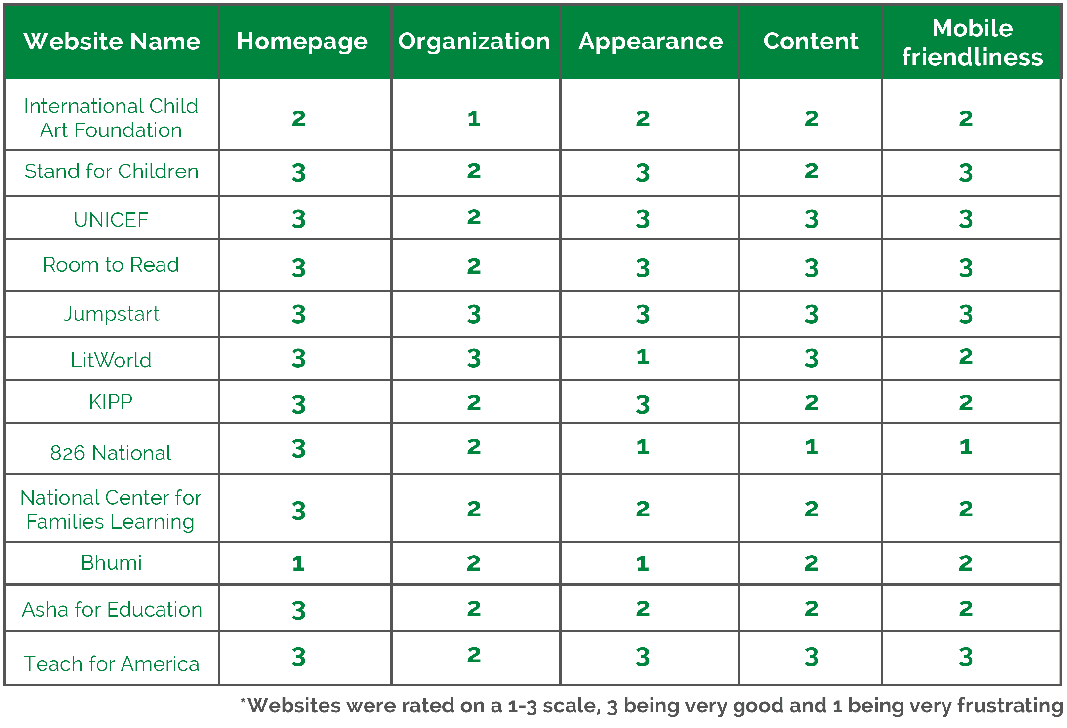
In order to make the website effective and visually attractive, it was important for us to assess its current and potential competitor sites. It also helped us to see how they solve similar user needs for their users. We selected 12 websites for our competitive review and compared them across 5 dimensions.
First Impressions matter - The websites should clearly communicate the organization’s objectives at first glance. Furthermore, it should Tactfully grab the attention of the user. Important website functions such as ‘Donate’ and ‘Get Involved’ are more prominent to grab the user’s attention.
The website should have a clear hierarchy with intuitively placed subcategories. Most importantly, The navigation labels should be clear and precise, guiding the user along with their intended path.
Communicating effectively is easier with supporting visuals than with an excess of words.
Prioritizing aesthetics over features is important as aesthetic similarities ensures a cohesive experience across platforms without sacrificing quality.
Minimal, clean, and flat design helps minimize visual and cognitive load for the users, allowing them to focus on important elements.
Overall, we learned that our competitors generally excel in their first impressions. Beyond the homepage, however, our design should prioritize an adaptable site structure for mobile, the preservation of our organization’s narrative across platforms, and a balance of image and text-based content.
After working on the Information Architecture and analyzing the competitor sites we moved to the designing stage. We started this process by creating three tasks and the ideal user flows for the users to evaluate. We then designed two low-fidelity digital prototypes, one for mobile and one desktop, using Balsamiq and Marvel. We also conducted user tests each to get their feedback on the prototypes.
From our user research, we had discovered that there were some key pages on a non-profit organization’s website that the users would like to visit. So we decided to keep them as our main focus for the user testing task. For the purpose of testing our prototype, 6 actual users were recruited and observed.
User Testing Tasks
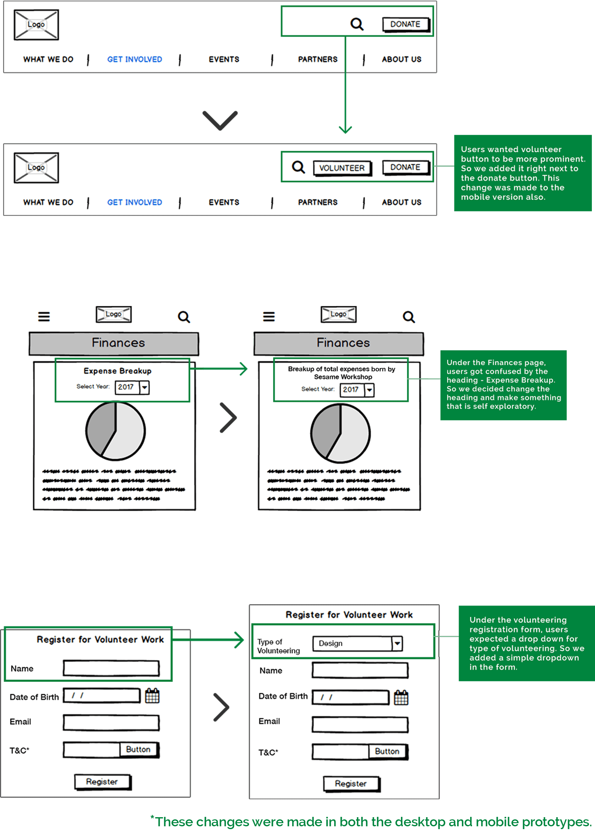
Overall, users gave us a positive response while testing our prototypes, but they also pointed out some minor improvements in the interface that helped us in making the final prototype more user-friendly and visually appealing.
Feedbacks provided in the user testing were:
This was the final stage where we delivered the final redesign of Sesame Workshop’s website. We used Sketch and Marvel to convert our low-fidelity prototypes into high-fidelity prototypes. We decided to create high-fidelity prototypes of the same tasks that we tested in our low-fidelity prototype evaluation.
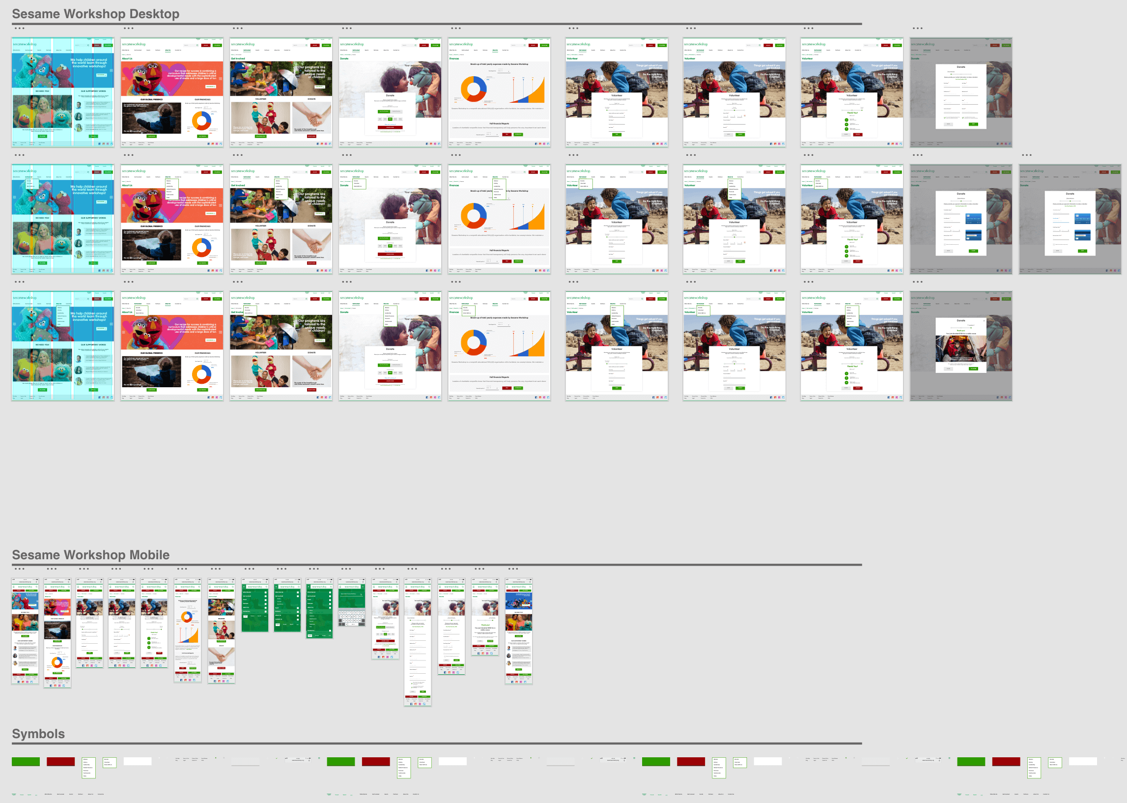
Once we were confident with our flow and concept, we decided to create the desktop prototypes. We started this process by creating a style guide (based on Sesame Workshop’s brand guidelines) for the user interface. We tried to make a strong and consistent layout with streamlined and understandable information architecture.
Here is an interactive prototype of your redesign
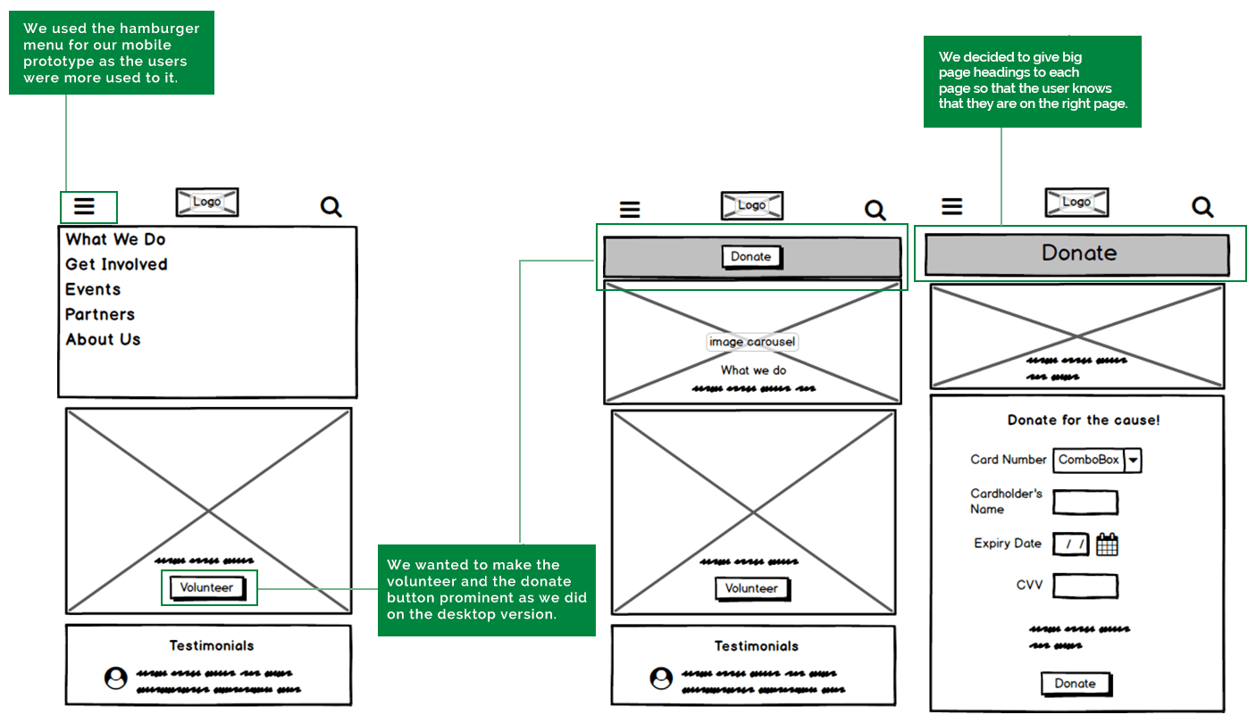
For the mobile, we focused on keeping content and appearance consistent with desktop experience and optimize the navigation and layout for the small screen.
The redesign of the Sesame Workshop’s website has had a positive impact on my learning experience. This project helped me understanding that UX is all about representing the user in the whole design process. When I chose teachers and education professionals as my target users, I knew my main challenge would be to design a flow that would be as minimal as possible. I did this by optimizing button and UI placement, and limiting the number of screens. For example, through my research, I got to know the main elements of the website what were to be focused from the user’s point of view - Finance, Volunteer and Donate, so I gave that more visual importance those elements.
Throughout the design process, I had to make difficult choices in terms of what elements were essential for my target user group. At the same time, I ensured the visual aesthetic of that website and the mobile version would match Sesame Workshop's branding. In the end, I feel I was able to create a design that accomplished its goal to best provide information in an effective manner.